
PROBLEM
01
CONVERTING ATTENTION INTO RETENTION
Honeycomb was created as part of an airdrop-driven growth campaign, designed to attract users from Ethereum mainnet at a time when gas fees made everyday participation expensive and impractical. The goal was not just to distribute a new reward token, but to use the airdrop as an entry point into the broader 1Hive ecosystem.Airdrop campaigns are inherently short-term — users claim rewards and leave. The design challenge was to build something that gave users a reason to stay: a tool that made participating in the ecosystem feel structured and rewarding beyond the initial claim. Honeycomb needed to turn a one-time event into an ongoing relationship with the protocol.
MY ROLE
02
Honeycomb was built in a DAO environment with no strict roles. I took ownership of UX/UI design, collaborating directly with developers and community contributors to turn the reward system into a usable product experience. My focus was on shaping the product structure, user flows, and interface across desktop and mobile.
Design
PRODUCT
UX/UI
Brand
TOOLS
FIGMA
AFTER EFFECTS
Timeline
MAR 21 - JUL 21
Team
I was the sole designer on the project, working within a small cross-functional team. Operating as the only designer meant owning every design decision end-to-end — from product structure to interaction states — with no design support or review process beyond direct collaboration with the team.
Frontend DeveloperFull-Stack DeveloperSmart Contract DeveloperProject LeadBusiness Development ManagerCommunity ManagerTokenomics SpecialistMarketing Manager
RESEARCH
03
COMPETITIVE AUDIT OF AIRDROP AND STAKING MECHANICS
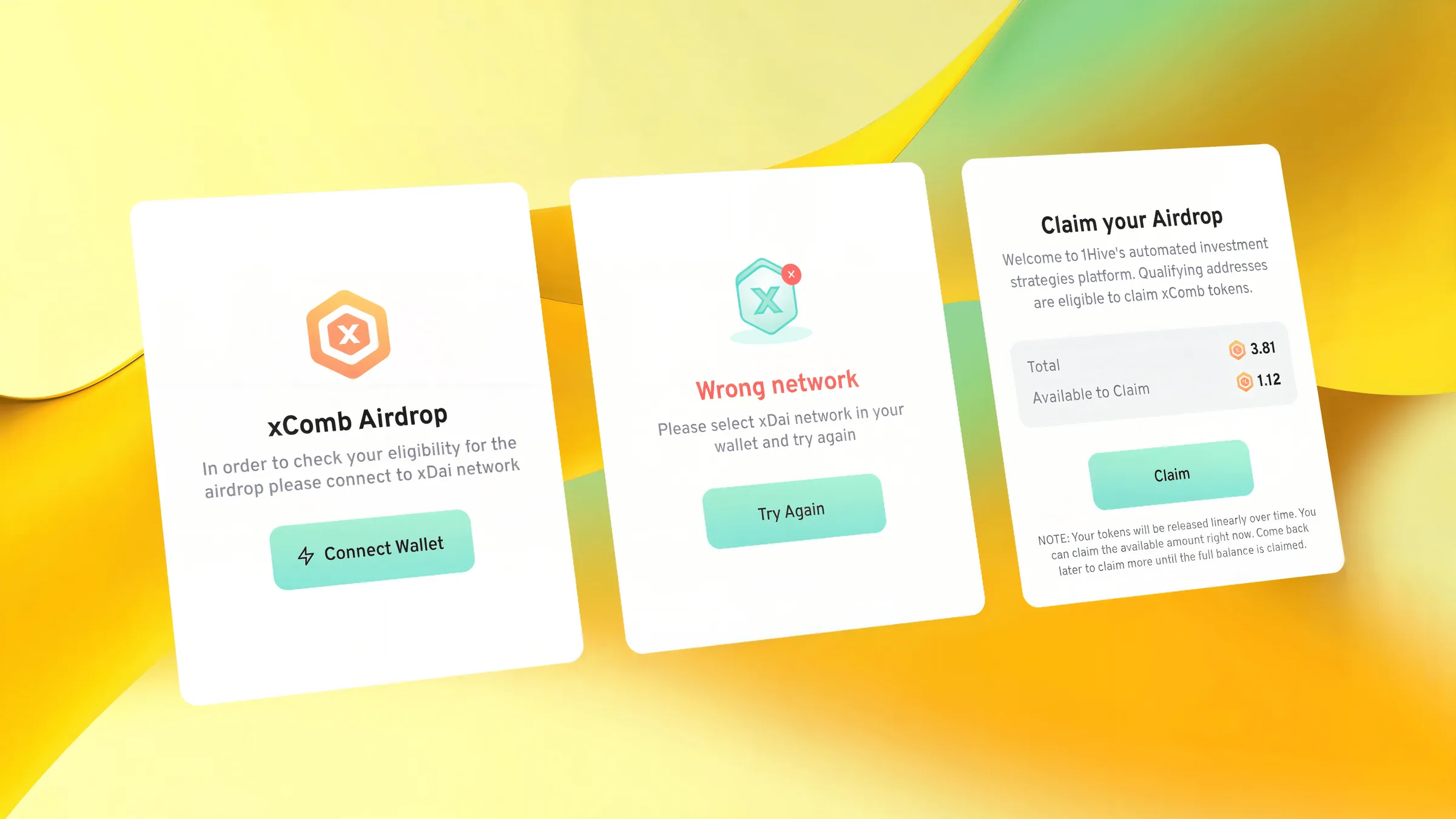
Airdrop campaigns were already an established growth mechanic in DeFi by 2021, with Sushiswap, Bao Finance, and QuickSwap running reward programs that attracted large user bases. I researched their mechanics firsthand — going through the full process of providing liquidity, staking, and claiming rewards on each platform.The goal was to map where these flows broke down. What I consistently found was that the steps required to qualify for and claim rewards were scattered and poorly communicated. Users were expected to move between multiple interfaces with no guidance on what to do next, no visibility into their progress, and no clear indication of when or how rewards would become available. The experience assumed protocol knowledge that most users didn't have.A second pattern emerged around reward visibility: in most platforms, the value users were earning stayed hidden until after they had already committed their capital. This created a trust problem — users were asked to take action before understanding what they were getting in return.These two findings — fragmented cross-app journeys and invisible reward states — directly shaped how Honeycomb was designed.
The solution
04
HONEYCOMB AS THE DEFI MANAGEMENT INTERFACE
Honeycomb served as the central hub for the 1Hive ecosystem, bringing together access to Honeyswap, Agave, airdrop claiming, and LP staking into a single interface. The sections linking to external products weren't embedded — they were deliberate entry points that sent users to the right place and brought them back with context intact.
Guiding the cross-app journey
The core participation flow required users to supply liquidity on Honeyswap, then return to Honeycomb to stake their LP tokens and start earning rewards. This cross-app handoff was the primary UX risk — users who didn't understand the sequence would drop off between steps. I broke the process into an explicit guided flow with a clear step structure, so users always knew where they were in the journey, what they had completed, and what came next. The interface treated the return from Honeyswap as a checkpoint, not a restart.
Making rewards visible before commitment
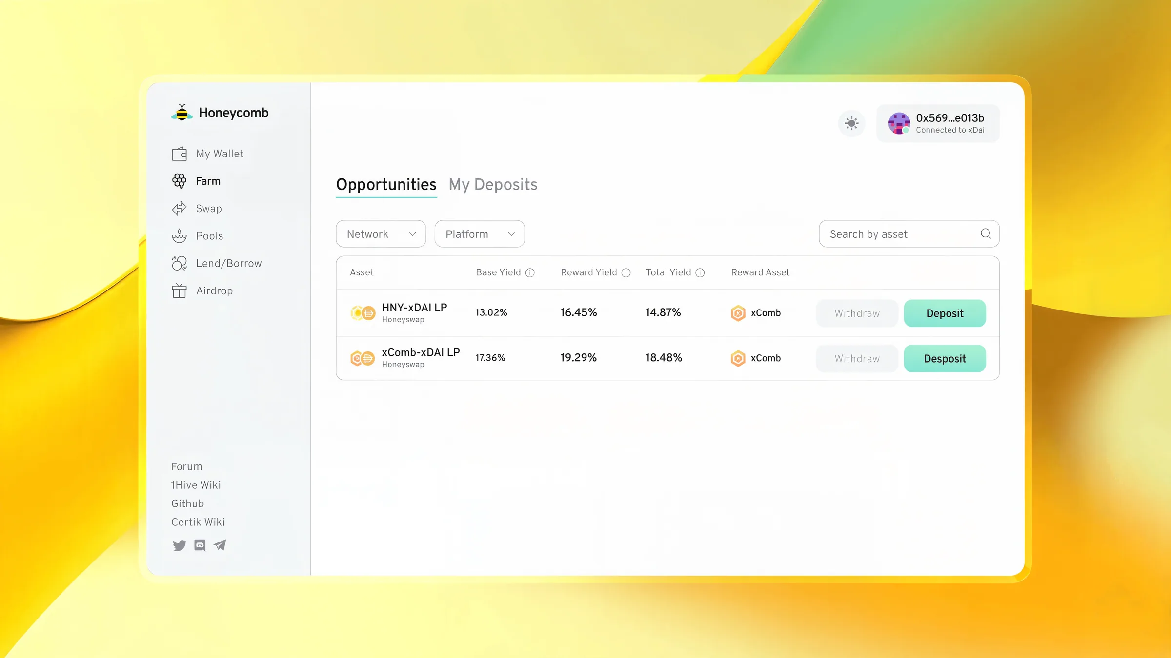
Based on what I observed in the competitive audit, I made the reward state visible from the moment a user connected their wallet — before they staked anything. Projected earnings, current APY, and vesting schedule were surfaced upfront so users could evaluate participation on their own terms rather than discovering the terms after the fact.
Vesting visualization
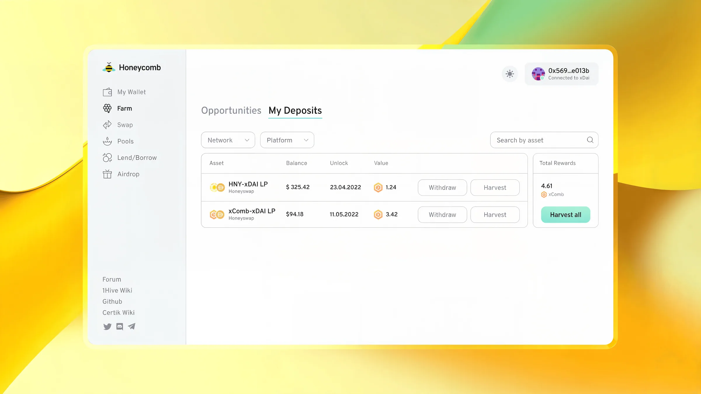
The airdrop rewards followed a linear 6-month vesting schedule. Rather than showing this as a number or a date, I designed a visual timeline that showed tokens unlocking progressively over time — making the schedule feel tangible and keeping users oriented around a clear endpoint. This gave users a reason to return regularly and track progress rather than claiming and leaving.
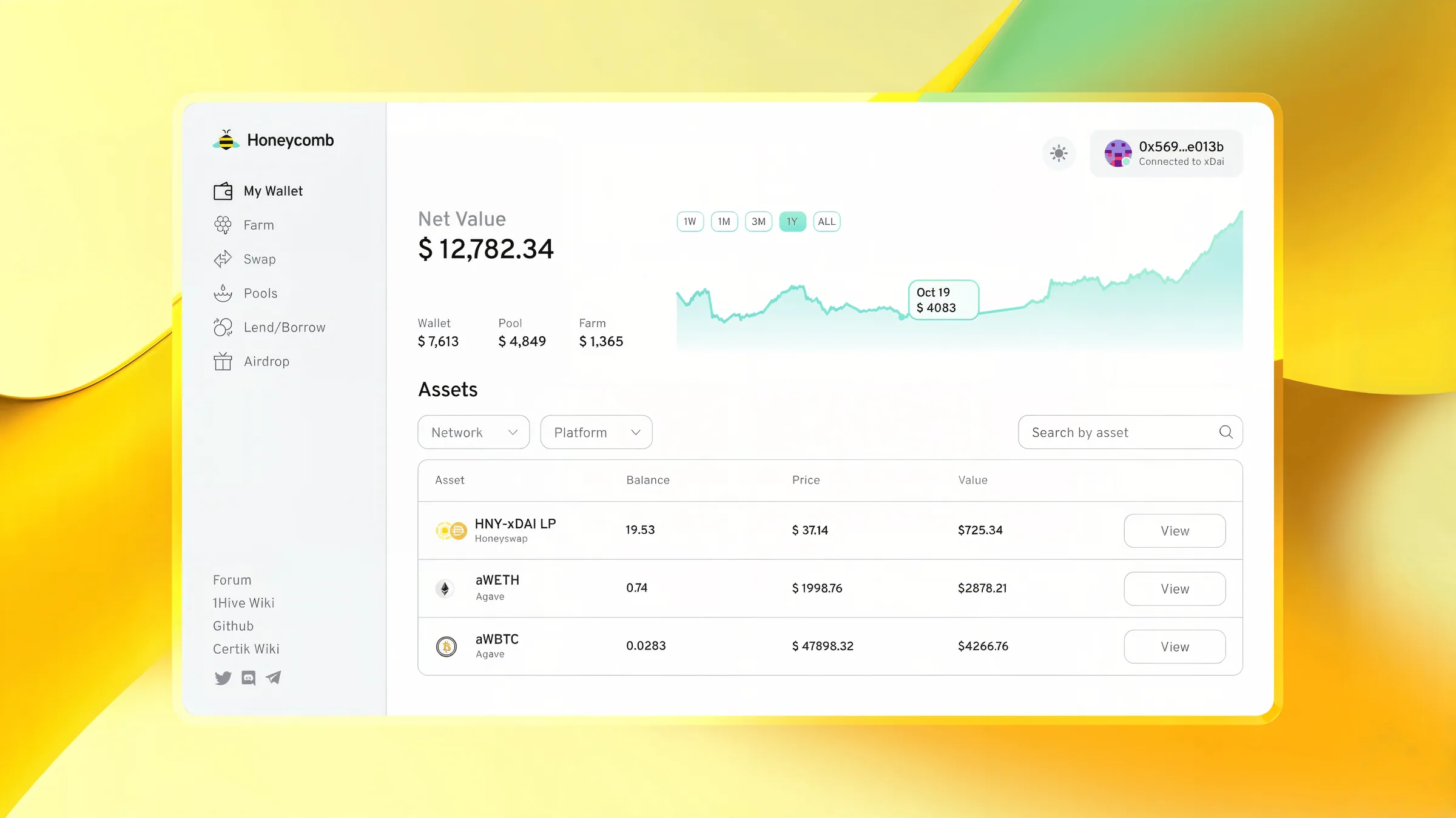
The interface was developed with a mobile-first layout. Since a significant portion of the user base operated through mobile wallets, the experience was optimized for smaller screens from the start. The same system later supported expansion into additional networks as the ecosystem grew.

Vesting visualization
The airdrop rewards followed a linear 6-month vesting schedule. Rather than showing this as a number or a date, I designed a visual timeline that showed tokens unlocking progressively over time — making the schedule feel tangible and keeping users oriented around a clear endpoint. This gave users a reason to return regularly and track progress rather than claiming and leaving.
IMPACT
05
The airdrop campaign attracted a large number of new users, which led to a visible increase in activity on Honeyswap. Trading volume rose significantly during the campaign, reflecting higher participation across the ecosystem and increased interest in 1Hive products.
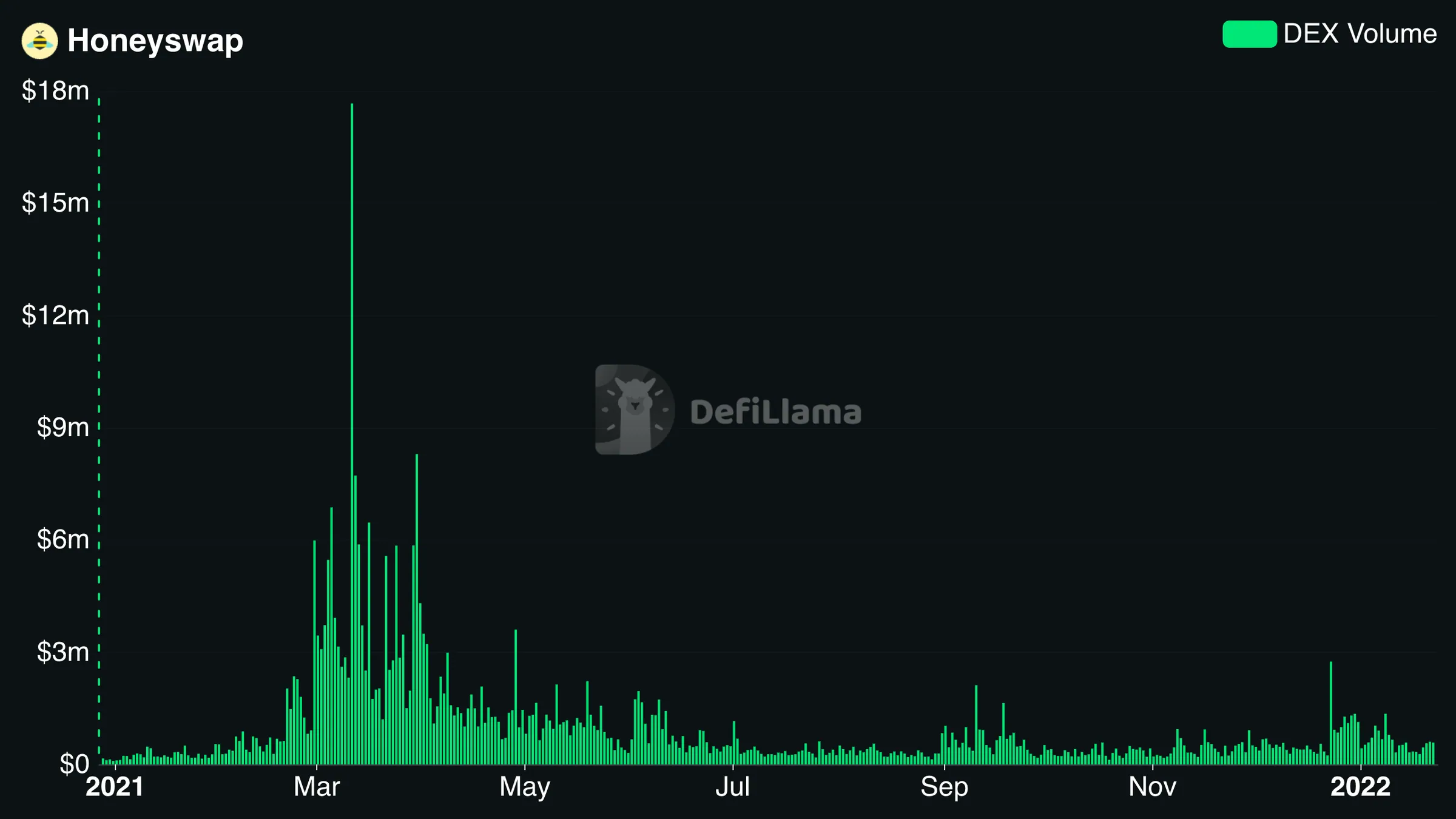
HONEYSWAP Volume DATA FROM DEFILAMA
By making vesting and staking easy to understand and track, users remained active over time instead of leaving after the initial rewards. Liquidity on Honeyswap increased from $7M to $18.5M within the system, strengthening the overall network.
By making vesting and staking easy to understand and track, users remained active over time instead of leaving after the initial rewards. As a result, we saw a sharp increasy in liquidity on Honeyswap increased from 7 millions to 18.5 millions of dollars iwithin the system, strengthening the overall network.
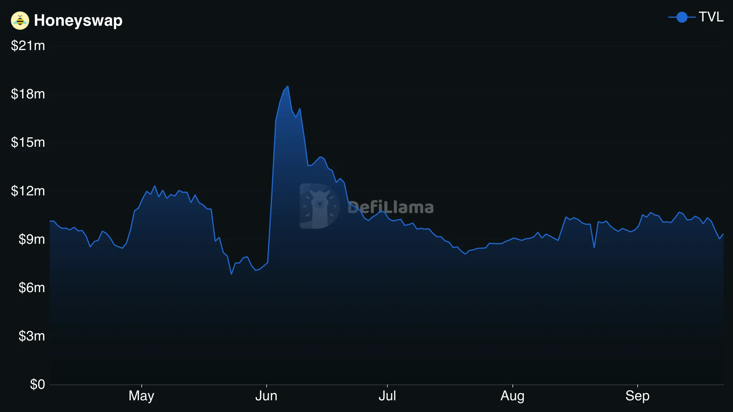
HONEYSWAP TVL DATA FROM DEFILAMA
Reflections
06
This project showed me how directly design influences growth in product ecosystems. When participation is driven by incentives, the interface becomes a stabilizing layer that shapes whether users stay or leave.
My main takeaway was that simplifying complex mechanics into clear, structured flows can dramatically lower the barrier to entry. Honeycomb taught me how to design not just for usability, but for long-term engagement — treating UX as a core part of the product's growth strategy, not a visual afterthought.